SaraSzpak-Makeup
Sara Szpak Make-Up Artist and Hair Stylist
About
Sara’s Szpak B2C website showcasing an award-winning Make-Up Artist and Hair Stylist business located in Newport - Wales. Sara Szpak specialises in bridal makeup, hair design and creative makeovers for commercial photoshoots and also provides private make-up 1-1 lessons.
I have designed the website to look professional with a weeding colour scheme as it is the main focus of the business. It is designed to be fully responsive and accessible on a range of devices, making it easy to navigate for potential and existing customers.
The goal of the website is to provide an up-to-date pictures portfolio (bridal make-up, bridal hairstyles and creative makeovers), information about the services it delivers, and also allow an easy way for getting in touch with the business owner.
The site must meet all the requirements and goals as potential visitors will most likely be comparing other similar local services, so the final website look must stand out and show everything the user would want to see.
Link to live site
Contents
User Experience
User Stories
As a customer visiting the website I want:
- See the short information about Sara Szpak, and learn about services she provides.
- Have an easy access to the all site’s content by clicking the correct navigation link.
- Have an easy access to the social media links such as Instagram, Facebook and E-Mail address.
- See the up-to-date portfolio containing high quality pictures showcasing last make-ups and hairstyles.
- See testimonials from previous customers to learn about their experience, and make sure that provided services are of high quality and can be trusted.
- See recent award winning certificates
- Find information about prices
- Be able to contact the business owner as I wish through social media, e-mail or a contact form.
- Read terms and conditions.
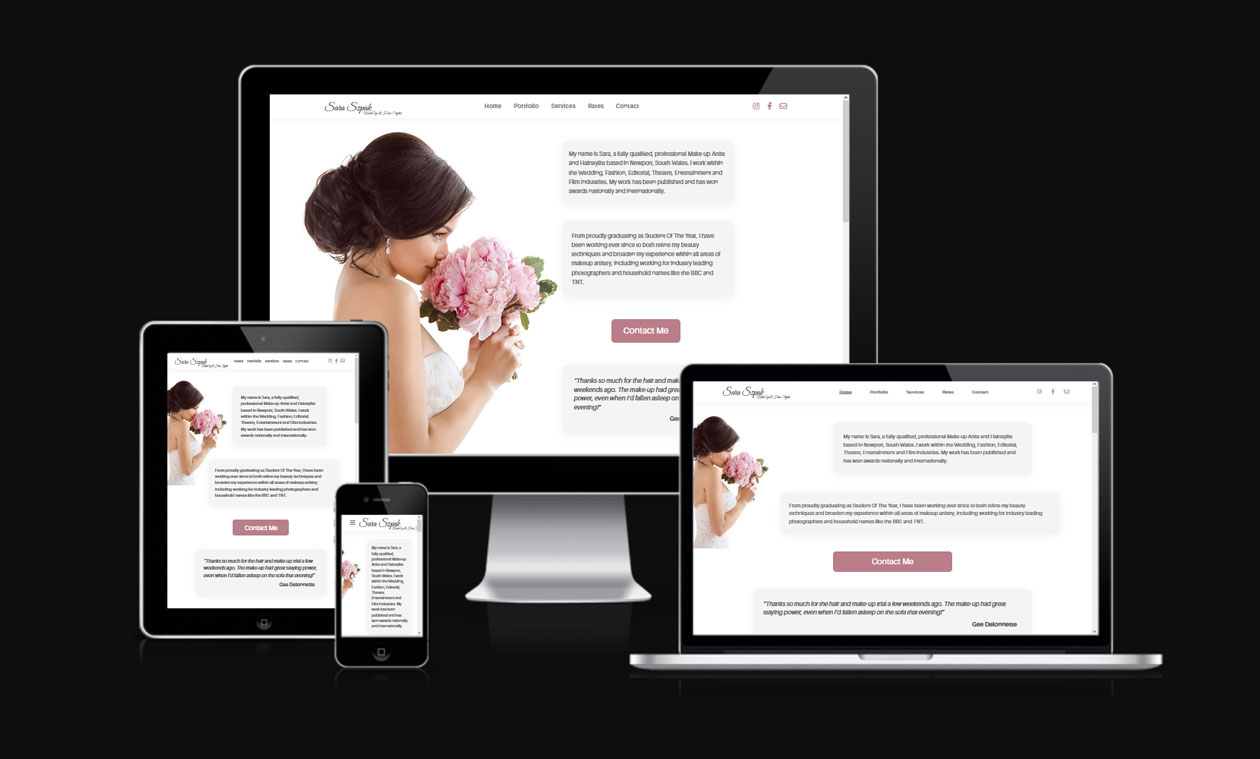
Responsive Web Design
Website is fully responsive, with use of 4 breakpoints:
- 375px - mobile size,
- 768px - tablet size,
- 1440px - desktop size,
- 1950px - desktop large size.
Design
Mockup
-
Mockup were created using Figma
- Website designed myself: Tomasz Ostroga
- Desktop/Mobile Mockups
Imagery
Images provided by business owner Sara Szpak. All images were compressed for faster loading speeds, with focus on preserving overall quality.
Typography
-
- Used ‘Great Vibes’: “handwritten” font for the logo as it perfectly matches the artistic design of the website.
-
- Used ‘Aileron’ as a main font because its natural design brings the user clean reading.
Technologies
Languages
-
- Used for the creation of the markup for the website content.
-
- Cascading Style Sheets language used to style individual pages.
-
- Scripting language used mainly for making website interactive (Logic for mobile menu (show/hide toggle), controlling styles addition/removal based on ‘mouse’ events).
Libraries
- SASS
- helps with easier CSS development and better readability
- Styles wrote with mobile first approach as it does make the process of writing styles simpler.
Other Tools
-
- Version control tool for tracking changes in code.
-
- Hosting service for software development and version control using Git.
-
- Icon library and toolkit.
-
- For image manipulation/optimization.
-
- Used to generate a favicon for the website title
-
- Used to audit the site for performance, quality, best practices and SEO.
-
- An online tool to check how responsive the website is on different devices. Screenshot generated by the tool is presented in about section of the README file.
-
- Validator checks the markup validity of Web documents in HTML, XHTML, SMIL, MathML, etc.
-
- Online tool validates CSS files as CSS level 3 + SVG.
Testing
Full testing process and results can be found here.
Deployment
For website deployment I have decided to go with Vercel because it provides fast website load speeds, simple configuration setup and very easy deployment process.
- From the dashboard create new “Project”,
- Login with GitHub,
- Import desired git repository,
- Configure project,
- Deploy. Simple as that!
After deployment your project is connected to the repository you have selected, and is automatically deployed every time when repository changes.
Credits
Articles
-
Stumbled upon the issue where border radius didn’t provide expected results for rounding table corners. Have found solution for the issue on StackOverflow: https://stackoverflow.com/questions/628301/css3s-border-radius-property-and-border-collapsecollapse-dont-mix-how-can-i
-
Portfolio gallery is based on the article how to create a responsive image gallery with CSS flexbox. Examples presented are straightforward and taught me how to build image gallery maintaining image aspect ratios (fully responsive).
https://blog.logrocket.com/responsive-image-gallery-css-flexbox/
Acknowledgements
- My mentor Dick Vlaanderen for his advice and guidance during this project.
- Google search engine for limitless resources about web development.
- Stackoverflow community for general advices and solution to problems I have encountered.